Do more than write fonts with your Cricut. Today we're going to talk about making advanced font designs with your Cricut. This is lesson 4 in my drawing with your Cricut series. You aren't stuck just drawing or cutting fonts,You can make fancy cut designs and font art using your Cricut and all of those fonts you love.
Many of the cut fonts I've created, available in design space, were specifically designed to cut and draw. However, you can make your own custom cut words with just a few simple steps. The goal is to create a word shape that will cut as an outline around your pretty drawn/written words. I'll show you how!
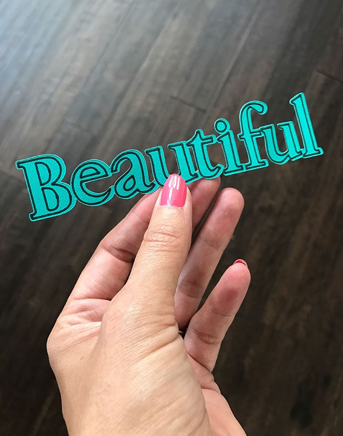
Making Advanced Font Designs with Your Cricut
Sometimes adding drawn font/words to your Cricut projects requires a little extra design layout. You always need to have a cut layer attached under anything you draw with the pen, but creating those cut shapes isn't always an obvious process. All you need to do is create a cut shape to coordinate with your writing and then weld it to whatever design you are incorporating the words.
If you really want to get fancy with your font layout, You can break apart most fonts down to individual letters. You just need to un-attach and ungroup all the letters in your words. Be careful, when you break apart all your words, the letters now act as individual shapes instead of text and you can no longer edit them as text. Use this only as a last resort, understanding you won't be able to change the type. I manually adjust individual letters when I want a very specific letter spacing or alignment.
With every instance of font draw and cut, the Cricut will first draw and then cut, so keep this in mind when you are designing your layouts.
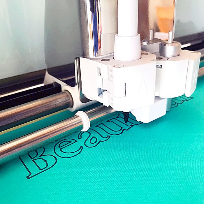
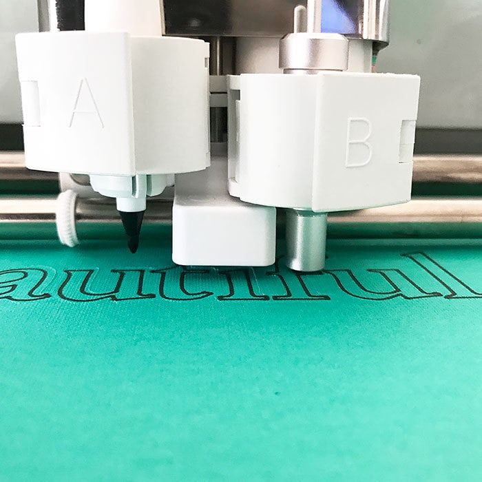
Adjusting Font Layouts Beyond the Standard Settings
You can go with the basic settings in Design Space and create very nice drawn font art. Today we'll cover how you can take that one step further to incorporate fonts in designs other than just by themselves for writing.
For this tutorial you need the following materials:
- Cricut Cutting Machine – Explore or newer will work
- Cricut Design Space – this tutorial is specifically using DS version 3
- Cricut pens – your choice
- Paper – use practice paper to test out the techniques
Today we're going to talk about:
- Quick Step-by-Step to create a single cut word
- Finding the right font for fancy/advanced designs
- Using different font layers to create font art
- Welding letters to create a single cut out
If you haven't tried using fonts with your Cricut machine and the pen tools, check out this article about how to write fonts with your Cricut first.
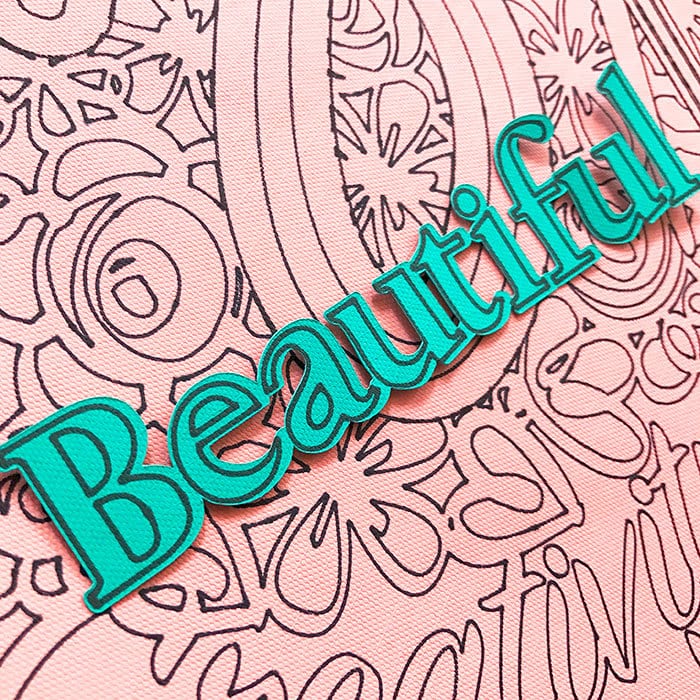
Quick Step-by-Step to create a single cut word
I'll go into the details of this below. But if you are ready to just jump in and make single cut words, here's how.
- Choose a font with at least 1 cut layer and 1 draw layer. A third layer with a thicker outline preferred.
- Hide all the layers except the bottom-most layer but make sure everything is still grouped together.
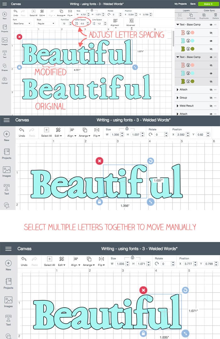
- using the toolbar at the top of Design Space, adjust the letter spacing of the word on this bottom layer until most of the letters overlap. All the layers of letters will also adjust. I hide the upper layers so I can see the overlapping process better.
- Make viewable all the layers. Ungroup all the letters from all the layers. Select each letter group and manually adjust spacing as needed. (“each letter group” meaning the select all the letter “B” characters together for the word Beautiful and move them together.
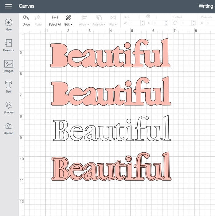
- Select all the letters in the bottom layer and weld them together to create a single cut line.
- Adjust drawn letters on top of the cut word as needed.
Finding the right font for fancy designs
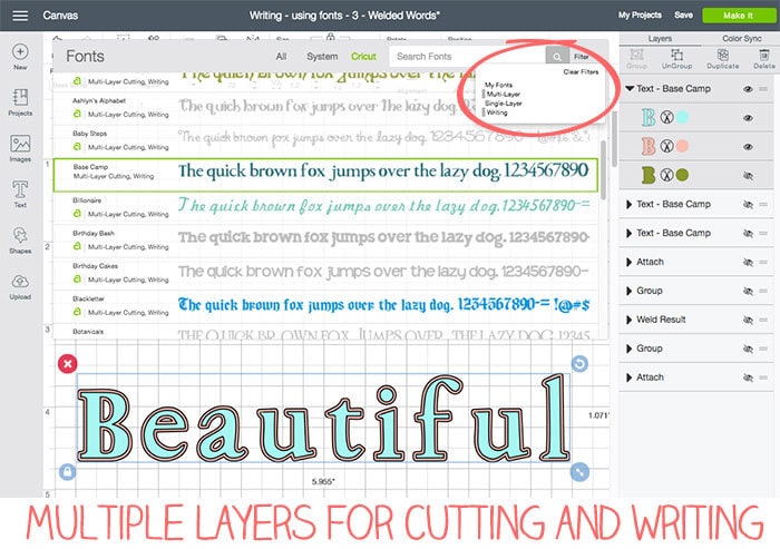
The first thing you need to do when making advanced font designs with your Cricut is choosing the right font. What you want to accomplish, will depend on which font is appropriate. You can review basic font choices in this article about using fonts with your Cricut. For advanced font designs, you need to make sure there is a writing layer and a thicker cut layer. Sometimes I prefer to use fonts that include a third outline/shadow layer as well. This third layer will allow you to create a design that is drawn with a nice padded edge cut around it.
You want the thick letters for those single word cut designs. Look for the thick, bold fonts, or fonts that have nice connecting shapes. A script font that has pieces on each letter that can easily overlap the next letter. Or bold fonts that are wide enough that they can also be overlapped. The overlapping is how you will be able to connect the letters into a single cut shape.
Using different font layers to create font art
Each layer of a font can usually be drawn. If you pick a font with writing layer/style, that layer can't be cut alone but it can be drawn on top of a fancy cut. A standard font cut will usually cut each individual letter out by itself. A font with a third layer, often times will also cut out each individual letter, but these letters are thicker and allow for nice welding. Remember to always attach a drawing shape or font to a cut design.
Note about Welding If you're unfamiliar with welding, this is the action in Design Space that allows you to select 2 or more cut lines and combine them into a single cut line. To create single cut words, you will need to weld the individual letters together to create one cut shape.
Welding letters to create a single cut out
There are a few ways to go about welding letters together, I will share them both below. Try each to see which works best for the font you have chosen. Each font may need a little different technique to easily create the look you want. For a good weld, you need the letters overlapping slightly. If each letter is just touching, the weld won't be as complete as you need.
Technique 1:
Use the font tools at the top of the Design Space menu help you space the letters. Start by selecting one of the font layers and adjust the letter spacing until the letter overlap. Some fonts will work really well and some will require more manual adjustment. If not all the fonts overlap nicely, that's ok. Get it as close as you can with this tool and then you can adjust individual letters as needed.
Technique 2:
Ungroup all the letters in the word and manually move each letter as needed until all the letters are overlapping.
Once you have all the letters overlapping either with the tool or manually, select all the letters in the word. Then, click on the weld button to join all the letters into a single cut shape.
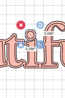
Don't forget: some letters have secondary pieces that you will need to manually move to include in part of a welded design. The letter “i” is a regular in this situation. Make sure to ungroup and move the dot of the “i” so that it too is welded into the single word cut.
I think it's easier to adjust the placement of all the layers of letters at the same time. This takes a little attention to detail as you will need to adjust letter space for each layer and then ungroup everything. Then make sure to select all the layers for each individual letter together and manually move as needed.
If you prefer to work one layer at a time, that's ok too. Start with your bottom-most layer, create the welds you need and then work up layer by layer.
Practice create fancy font designs using letter spacing and welds and you'll be able to add words into cut designs. Anything you can cut, you can weld and then draw on top of the shapes. Play with spacing to see how the welding will work.
Tip: save duplicates of your designs before you weld so if you don't like how a weld turns out you're not stuck starting over.
Take a look at the Canvas with this art





I love these amazing design’s! Your are a ROCKSTAR!!!!!
Thank you SO MUCH Amanda! I’d love to see what YOU create. If you’re on facebook, stop by the fb page and show me what you’re making. Or tag me on IG @100directions. 😀
Do you have any advice on trying to make a background/outline layer for fonts uploaded to design space? I love the versatility of being able to use any font I desire, however without it being a Cricut font it lacks the layers. Thanks!
It’s difficult to make a background layer directly in Design Space. It can be done.. but it depends on the font. One option is to duplicate the top layer 2 times. Move 1 layer to the top right and the other layer to the bottom left – so they are offset just a little from the main top layer. Then weld the two bottom layers. It’s not a perfect outline, but it can be a nice background shape. Another choice to create a layer of letters that is a little bigger that the main layer… but separate each individual letter and play with the sizing until it’s the outline you want. Neither is a perfect solution, but it might help a little.